Case studies
We Design It - Rethought Functions
Designer: Andrea Sallak
No matter how large and spacious a home may be, if the utility rooms are cramped, it won't be truly comfortable. Utility spaces are no longer secondary!

This garden family house is located in a charming village in Borsod and will be the new home of a young couple with a small child. The size and proportions of the house are basically good, with a spacious living room and dining area on the ground floor, along with a living room. The main wall running through the center divides the floor plan into two parts; on the left side are the utility rooms, which pose the biggest problem as they no longer meet today's standards. The kitchen is the most troublesome because the narrow and long room, segmented by doors, cannot accommodate modern kitchen appliances or even the housewife comfortably. Additionally, the couple loves cooking together, so they definitely want to make it more comfortable.

The new kitchen location
The issue is that the current kitchen cannot be expanded because the entrance to the garage is next to it. Therefore, we have no choice but to find a new location for it. This will likely involve a major renovation, but it will definitely increase the home's value and comfort. Fortunately, there is no shortage of square meters; we just need to use them more wisely. For example, there is a large central space currently serving only as a passageway, from which the rooms, including the toilet and bathroom, are accessible. Since these rooms are also in a dilapidated state and in need of complete renovation, it's worth considering how they could be made more spacious and comfortable. The key to the solution is functional exchange. This definitely requires a professional to examine the possibilities on-site, but since it is a family house with a basement, there is a high likelihood that there is no obstacle to swapping the wet rooms.

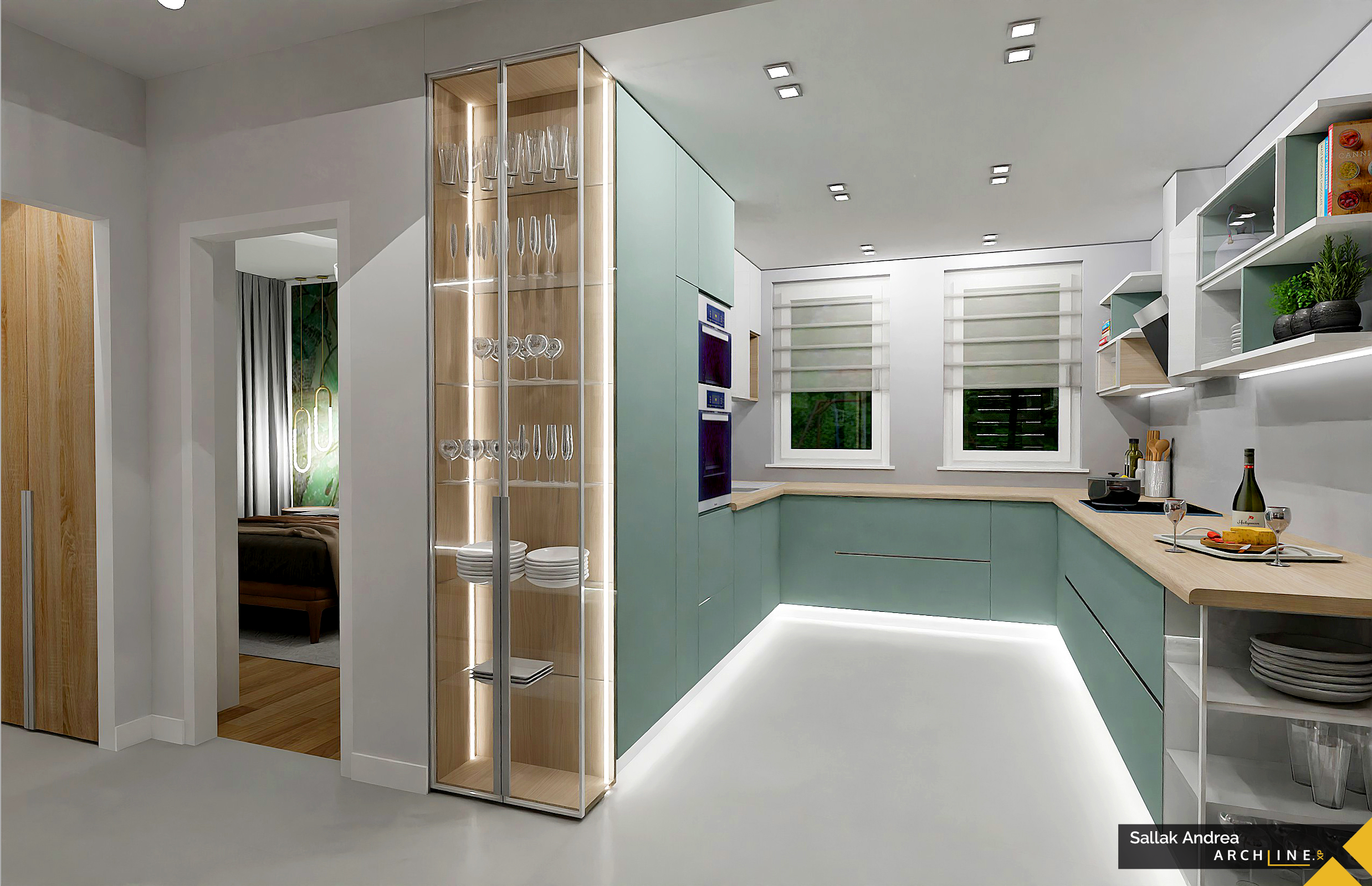
Thus, the new bathroom, which will also serve as a utility room, will be located where the kitchen is now. There was no space for it before, but now it can accommodate a washing machine, a dryer, a comfortable 80x100 cm shower cabin, a bidet next to the toilet, and plenty of storage space. The freed-up space can be opened up with the unnecessarily large passageway, which will be just right for the new kitchen. We will straighten the 45-degree entrance to the room here, which will also make it a few square meters larger. This way, the kitchen can be arranged in a U shape, accommodating all essential household appliances, providing ample workspace, and allowing two people to work comfortably side by side.
The staircase issue

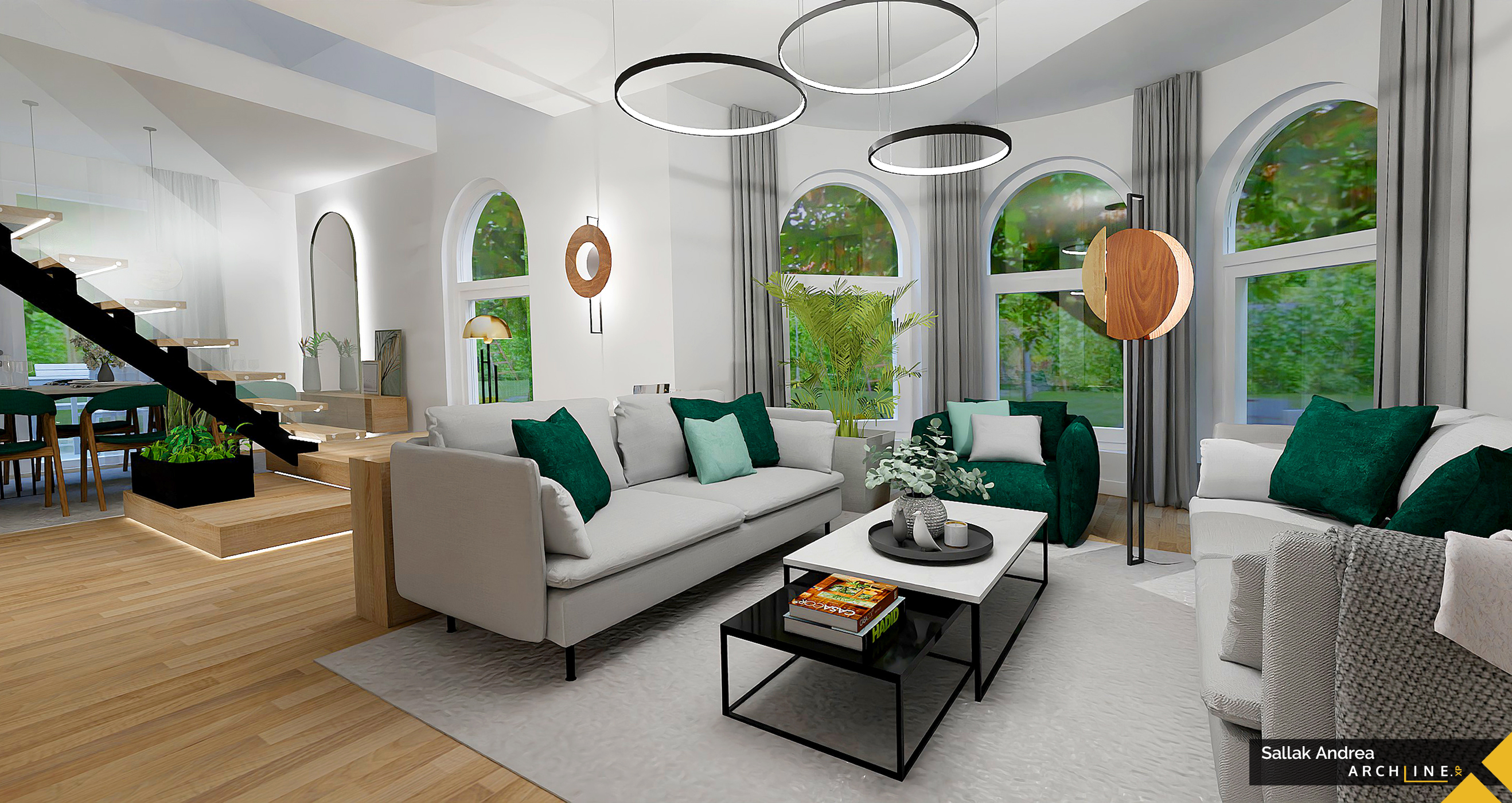
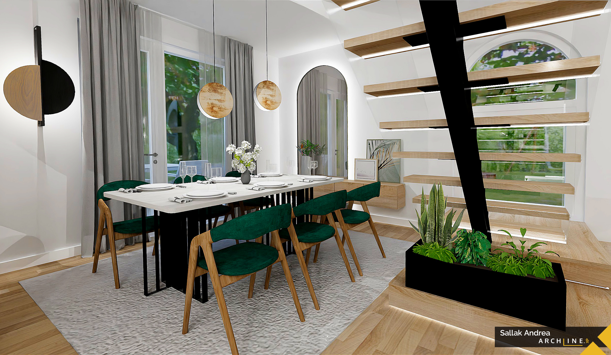
The only problematic point in the living room is the staircase leading to the upper floor, which divides the space in the middle. Moreover, it starts from an awkward spot by the window. Although its location cannot be changed, the situation can be improved. By replacing the first two steps with custom-made platforms, the first step will be further from the window. Instead of two supports, one will suffice, making the space airier with floating steps. Glass railings and LED lighting embedded in the steps will add elegance. This turns a disadvantage into an advantage, making the staircase the main attraction of the communal space. Another striking element is the stove in the living room. The family definitely wanted an alternative heating option, as there is a chimney in the main wall. Unfortunately, a fireplace is not feasible as it requires a different size and special chimney, which would need to be newly built, but the upstairs room's location doesn't allow this. Therefore, I recommend a stove with a visible firebox, which can be made even more interesting with a dark wall color.
Andrea Sallak
Interior Designer
Contacts:
Mobile: 36-30-911-9385
Facebook:www.facebook.com/sallakandrea
e-mail: This email address is being protected from spambots. You need JavaScript enabled to view it.

