Case studies
We Design It - Quality Change
Designer: Andrea Sallak
If a flat falls into inexperienced hands, the result of the renovation may be worse than the initial condition. The owners of this flat moved into this apartment in Buda in such a state.

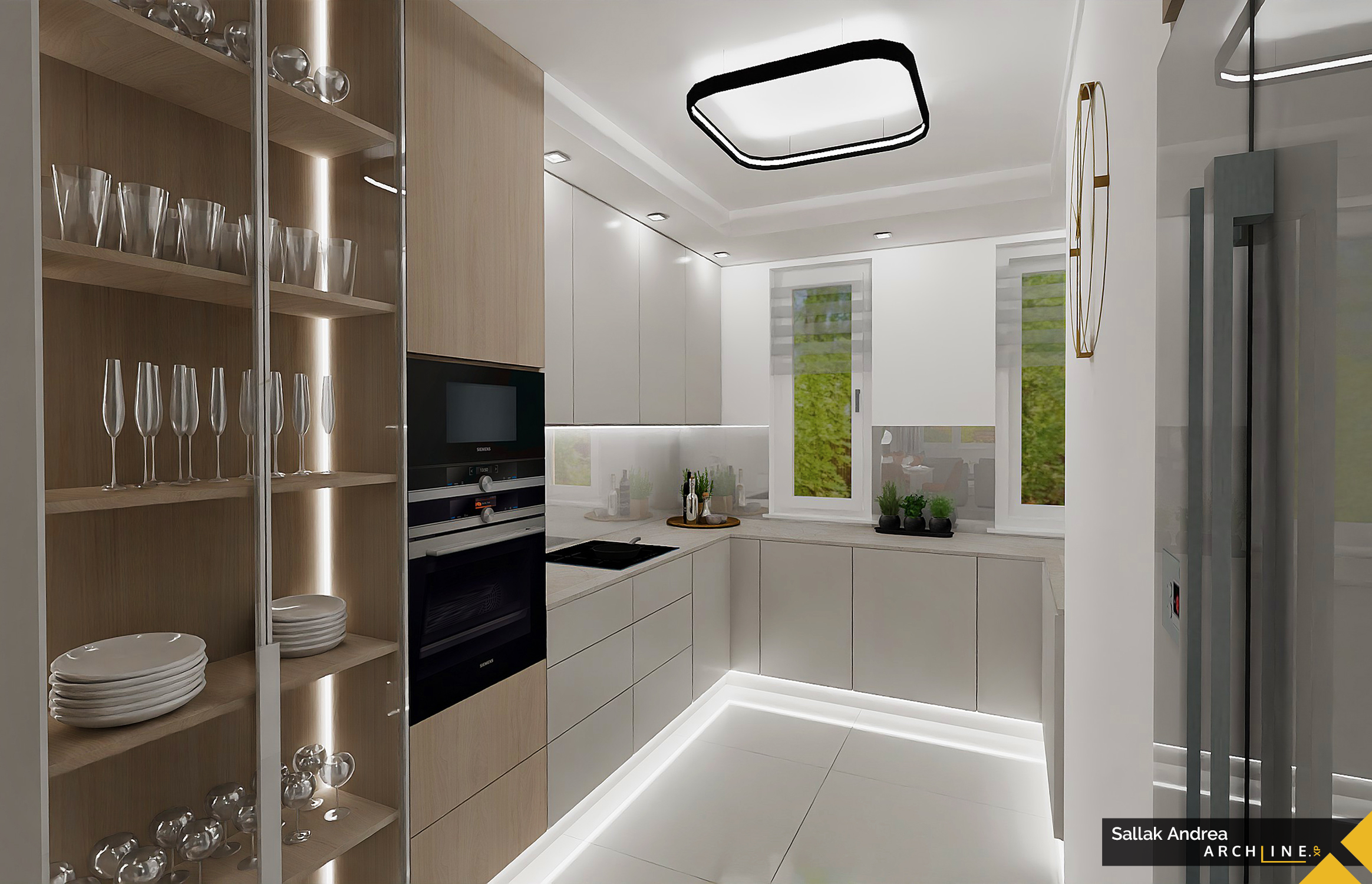
This ground floor apartment of almost 80 square metres was originally a traditional layout, consisting of two street-facing rooms, a hallway, a maid's room, a bathroom, and a kitchen. The previous owners carried out a major renovation, unfortunately reducing the two rooms by half and using them as bedrooms. All utility rooms were eliminated; thus, the maid's room, kitchen, pantry, and toilet were merged into the hallway. The result was a huge but dark space with the old foyer remaining in the middle like a pillar. This space became the kitchen, dining area, hall, and living room combined. Additionally, the bathroom and the newly separated toilet are directly accessible from here. The pantry window was bricked up, leaving only two narrow windows overlooking the courtyard, shaded by pine trees. So, the communal space where the family - parents and a teenage boy - spend most of their time is dark, depressive, and impossible to furnish. They also feel that this situation is unsustainable, so they asked for help.

Back to basics
Fortunately, the original floor plan is available, allowing the technical information to be visible to the professional, which makes the design easier. The goal is to make the flat livable and bright again. The kitchen is unnecessarily large, uncomfortable for the housewife, there is no hallway, and upon entry, one almost runs into the dining table. The "living room" has no windows, and the toilet is accessed from here. To find the right solution, we need to almost return to the original conditions. Half of the huge kitchen is sufficient; thus, we divide the space next to the original strang in half. The arrangement of the wall is determined in an unconventional way by the furnishing needs, so all necessary kitchen equipment is properly placed. The other half of the space is just enough for a teenage room. Here, a podium will accommodate the sizable bed, under which there are storage compartments, but there is still room for two wardrobes and a desk. This room opens from a small recess, where the toilet door can be turned, and here, the hallway coat rack and shoe storage will be placed. The same solution applies to the restored smaller bedroom, so the bathroom no longer opens from the communal space. This room will be the master bedroom, and since the size allows it, we will retain the walk-in closet accessible from here.
Sunny Living room

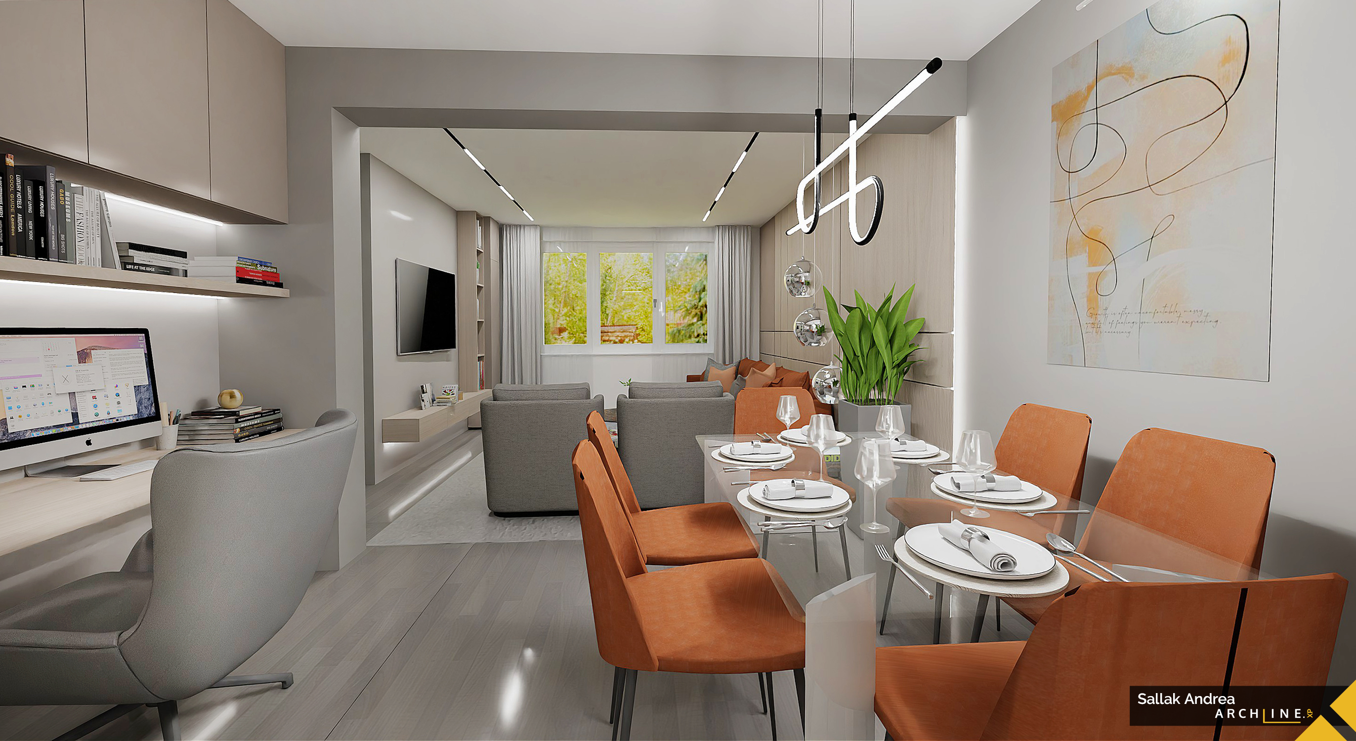
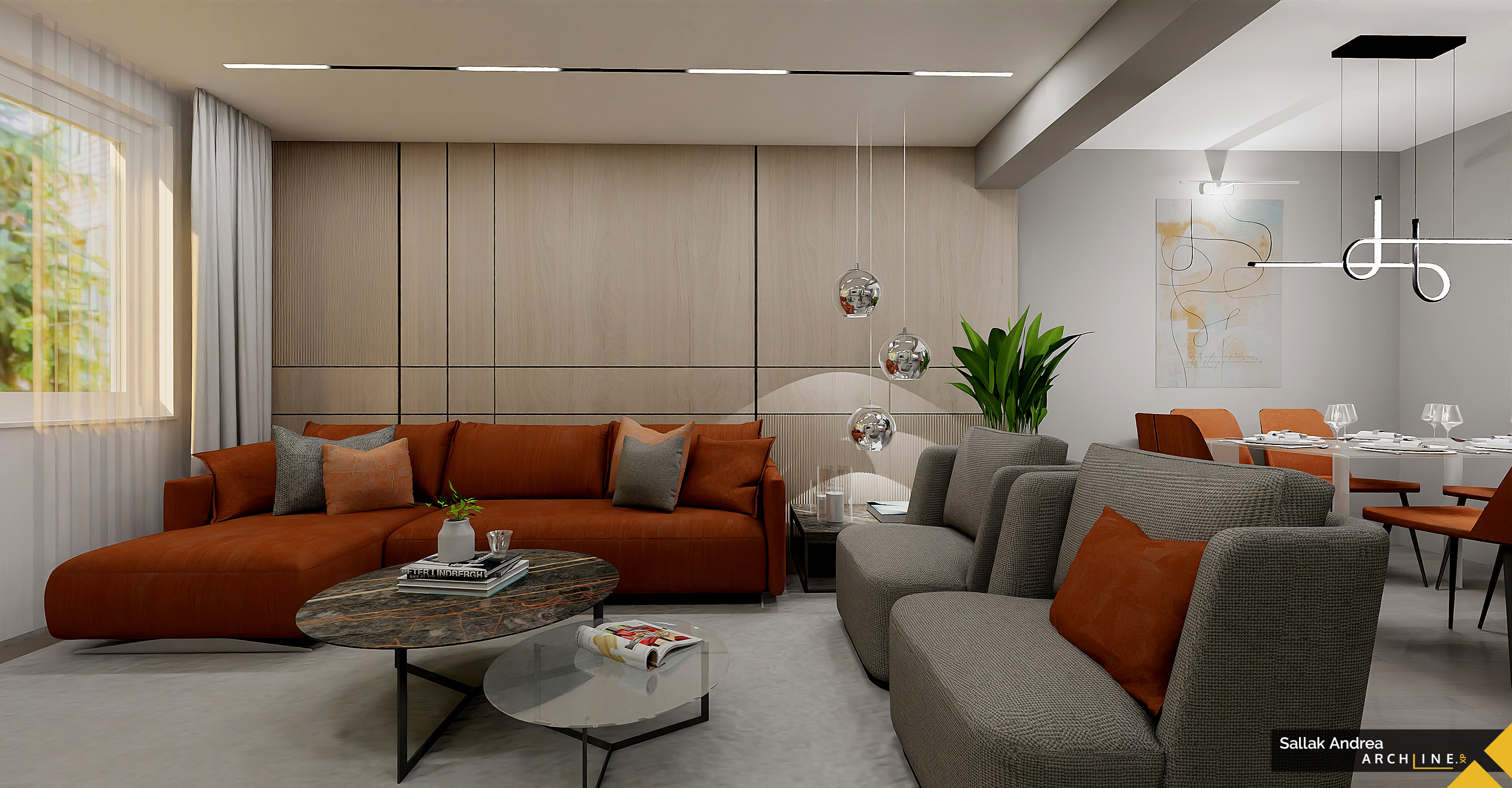
The other room, which is currently uncomfortable in size, is eliminated and connected to the hall, so that natural light illuminates the whole room again. This makes the space incredibly generous, where a truly elegant and spacious living room can be arranged, suitable for hosting guests and family gatherings. The uniqueness of the room lies in the individually designed, light wooden wall paneling. As a contrast to the neutral colors, the large, comfortable sofa receives a brick-red color, while the pillows adopt this year's color, apricot. This makes the interior truly contemporary and fresh. In the hallway, there is room for a modern dining table with six chairs, and the entrance hall opposite it can be used as the family's long-cherished home office. Two people can work at the large yet delicate table, and storage is always a good idea.
Andrea Sallak
Interior Designer
Contact:
Mobile: 36-30-911-9385
Facebook:www.facebook.com/sallakandrea
e-mail: This email address is being protected from spambots. You need JavaScript enabled to view it.

