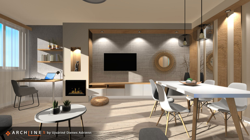
Picture of the month
Minimalist, cozy and practical, multifunctional interior with lightweight furniture. It is characterized by natural materials, splendid colour contrasts and the dynamism of curved and angular shapes, making it both exciting and livable.
| More articles... | ||
|---|---|---|
 |
May 2021 |
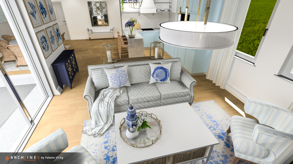
A pleasant scene with exciting textures. An interior gorgeously decorated with colours and shapes, with natural lighting effects..
|
 |
February 2021 |
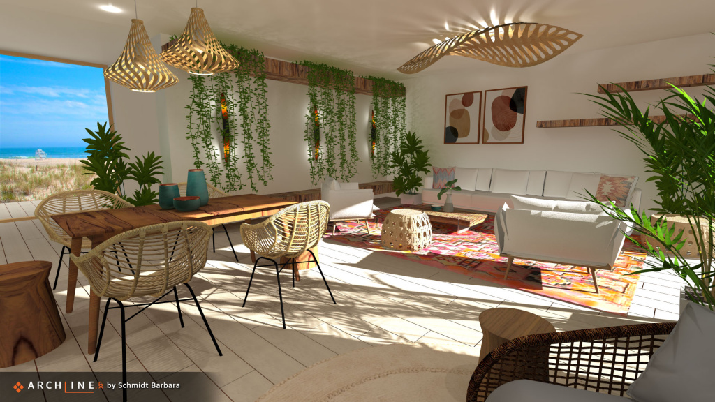
Lively, dynamic interior. An exciting combination of folk and biophilic styles, with natural materials, objects and an impressive play of light. A superbly composed link between the exterior and interior.
|
 |
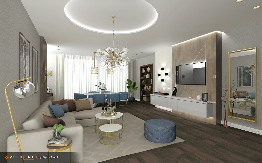
Januar 2021 |
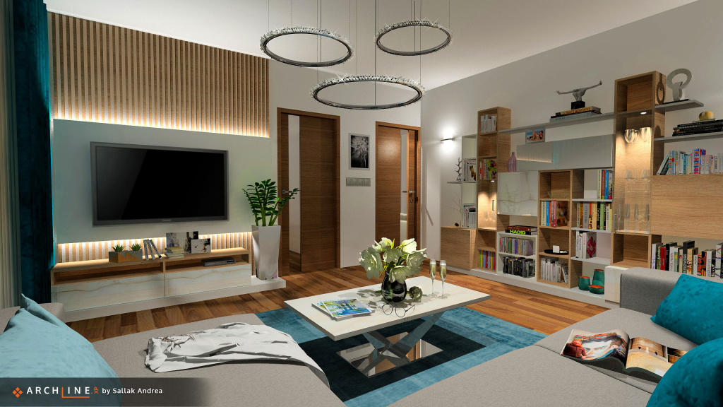
An interior made with defining geometric shapes and proportionate choice of colours. The details reveal a bit about the life, interests and every day shenanigans of the people who live here.
|
 |
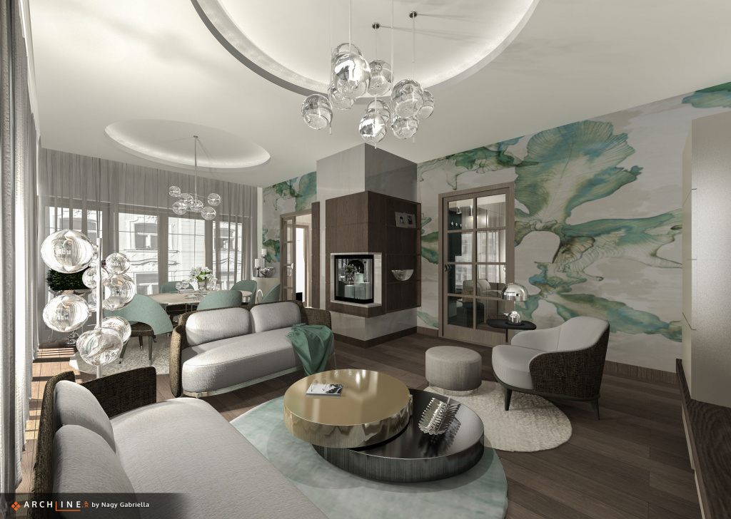
December 2020 |
Naturally soft shapes and geometrical forms unite a homely and elegant interior. The tiny details make the sight even fuller.
|
 |
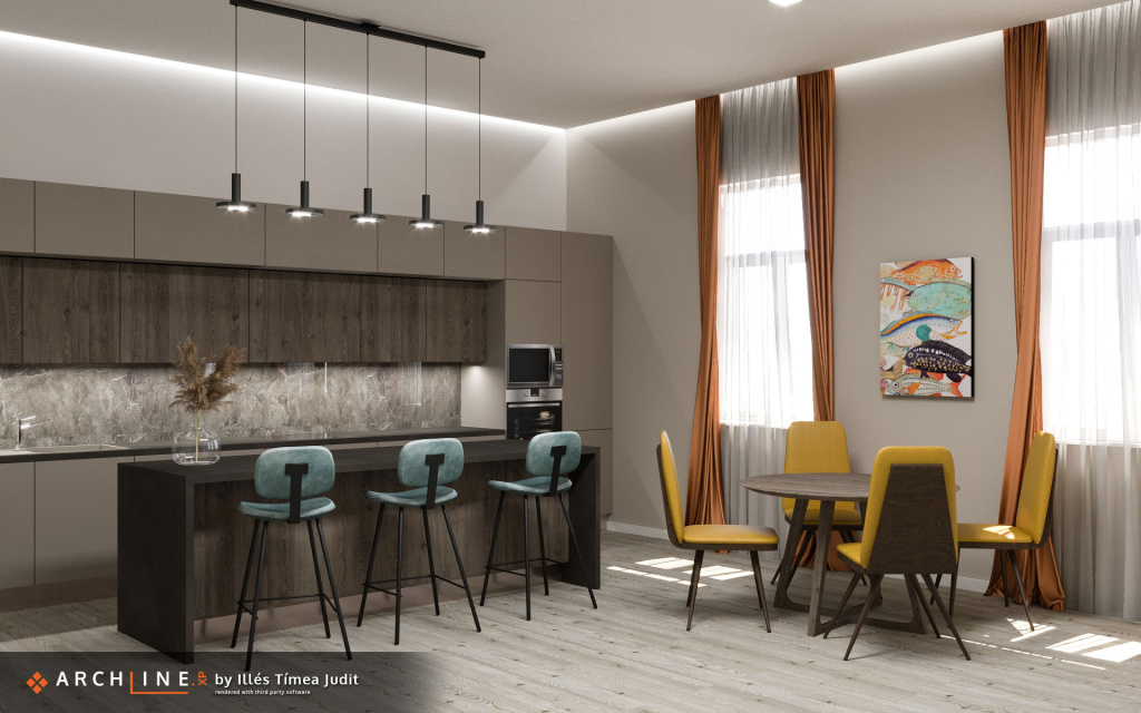
November 2020 |
This harmonious space was made with the use of a few well-chosen tones. The cleverly chosen wallpaper, textile, and glass- wooden- and metal surfaces generate an intimate balance.
|
 |
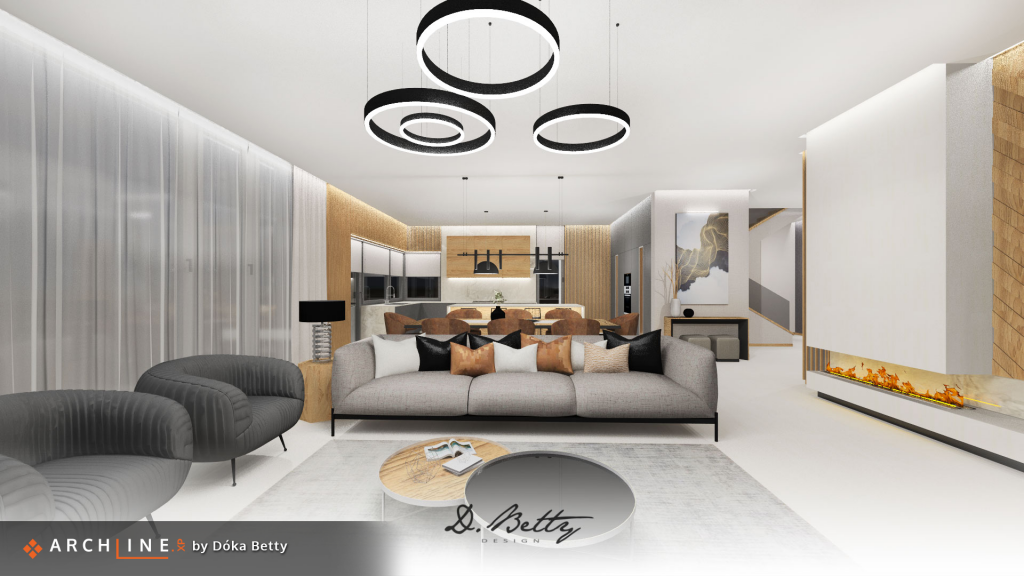
October 2020 |
This elegant interior is straight off the covers of a high-end design magazine. Clear choice of colours and materials, clean appearance are the key for its homeliness.
|
 |
September 2020 |
We can see an elegant harmonious interior, in which the harmoniously selected colors of well-chosen materials and accessories create a luxurious atmosphere.
|
 |
August 2020 |
The designer created an elegant, sophisticated atmosphere for this apartment/restaurant with the chosen color combinations, sophisticated furniture and accessories. It creates an iconic picture that we would love to enter.
|
 |
July 2020 |
The harmonious color management and the choice of special wallpaper make the mood of the room unique. |
 |
June 2020 |
Modern interior in which the chosen colors and patterns emphasize the closeness to nature. |
 |
May 2020 |
We can see a creatively furnished one-space apartment. However, it is well-separated by the suspended ceiling and the patterns used on it, as well as the floor coverings. Pleasant color tones were used by the designer, which make the different points of the apartment harmonious. |
 |
April 2020 |
An exciting, practical, and livable space realized on small floor space. By skillfully exploiting the features, every little detail is given a purpose and function. Boldly harmonious combinations make the sight indefatigable. |
 |
February 2020 |
A well-thought, practical and multi-functional space. By combining true and tried methods with modern surfaces and materials, a well-toned human scale interior emerges.
|
 |
January 2020 |
Clever choice of perspective, showing an interior full of life and details. The underlying style is nicely merging the ingenious and practical solutions.
|
 |
December 2019 |
Exciting shapes and colors, clever ideas and details shape this visual. The soft lighting results in a homely character.
|
 |
November 2019 |
The designer presents us with a spatial structure of high quality aesthetics. Its most outstanding feature is its great choice of materials, which enhance the visual tremenduously. The section on the left with its custom wall covering and designer accessories is truly remarkable.
|
 |
October 2019 |
A realisticly furnished livingroom, full of clever details. The earth-like colours are nicely offset by the blue upholstered furniture pieces. The dark flooring highlights certain elements, and at the same time, it makes this room the focal point of the home. The applied matte, and glossy surfaces are properly emphasized by the efficiently chosen lighting.
|
 |
September 2019 |
A clean, natural interior with well-balanced lighting. The organic and geometric colors and shapes merge into a pleasing and clear result.
|
 |
August 2019 |
The scene is elegant and homely. The well-chosen shapes and materials, combined with the outspoken design accessories, give a remarkable result.
|
 |
June 2019 |
An interior with many interesting small features, a high level of detail, and a clear communication of what these spaces are supposed to do. It is dominated by a pleasing harmony of shapes and materials.
|
 |
May 2019 |
Photorealistic visual with depth - lots of details and a special atmosphere. The clever solutions applied here turn this tiny space into a welcoming and warm nest for eating or casual relaxation.
|
 |
April 2019 |
An interior with elegant, high-standard aesthetics, and an attention to details. The choice of materials is outstanding, and the interior design methods and solutions applied are ingenious.
|
 |
March 2019 |
The designer had created a youthful, vivid spring-like interior. The colour combinations are trendy, and so are the accessories. The textures, textiles are very realistic, and with the addition of light and plants, this sight is bursting with life. Go there |
 |
February 2019 |
A forceful perspective with well thought and balanced interior desing shapes and methods. The deeper connection of the rooms are clearly shown even without clear physical boundaries. This is how this image becomes a living, breathing space. Go there |
 |
Picture of the year 2018 |
A luxorious visual. The high quality materials, reflections, furniture and lighting merge it into a clean, yet effective picture. Go there |
 |
January 2019 |
A daring match of exciting colours and patterns. The cleverly chosen lighting gives depth to the theme - the playful union of lights and shadows give a realistic result. Go there |
 |
December 2018 |
A luxorious visual. The high quality materials, reflections, furniture and lighting merge it into a clean, yet effective picture. Go there |
 |
November 2018 |
An enjoyable sight, which presents the space in an easy to understand manner. Its low-key colors and patterns become unique and self-sufficient by a cleverly chosen material setting - the parts are then merged into a whole by the soft lighting. Go there |
 |
October 2018 |
An effortlessly beautiful union of modern and classical elements. The accessories and materials were carefully picked, and they are supported by tasteful lighting. It is easy to grasp the function, connections and depth of this room, thanks to an ingeniously chosen viewpoint. Go there |
 |
September 2018 |
This soft and homely sight is brought about by the combination of scattered light, the applied colors and ingeniously chosen shapes. The clever and tiny details rhyme with the patterns of the wall tiling - together, they deepen the room imperceptibly, and bring the interior to life. Go there |

